In a few words the redesign makes Flickr a bit more social.
Starting September 10th, Flickr began rolling out the new design and even if you don’t have it as your default home page yet, you can switch to the new interface by navigating to the bottom of your Flickr home page and selecting this hyperlink:

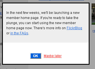
You’ll then see this message which gives you a chance to switch now or wait until later.

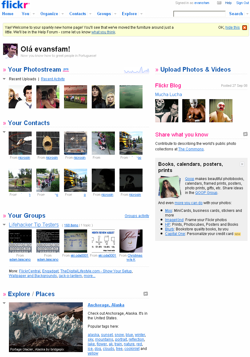
Here’s a screen-shot from my new Flickr home page. I’ve cropped out much of the white space you would see on the left and right of the page (expect to see advertisements here eventually):

You’ll notice that the new, more prominent recent activity section now takes up the majority of the top of the page when it’s expanded. You can customize the look of your home page by “muting” comments of specific threads or from specific users. You can also toggle notes, tags and favorites on or off. It’s obviously a move to make the already social photo sharing site more social. I like the new groups section on the home page that shows recent uploads from any of your groups.
The one thing users have complained about on the new design is the fact that comments aren’t on the page by default. You can still see those by clicking on the “recent activity” toggle which if you leave it will be the default view until switching back to “recent uploads.” This isn’t a big deal to me, but could be corrected if Flickr made it an option to show both.
Another update is a new Explore section at the bottom of the home page. A great way to check out some of the more interesting and quality photos on Flickr. There’s a “refresh” button to update the photos in the explore section – I like that and wish they’d add it to the groups section as well.
If you’re one of the Flickr members who track your stats on Flickr, you’ll also see the tiny “sparkline” graph just above your photostream slot like this one:

Doing that brings up the statistics page added this past July that you might have forgotten you had (only available to premium members). All-in-all, I really like the new design – a great update for an already great photo sharing site.
